Understanding Market Structure for Better Trade Entries
understanding market structure starts with reading swing highs and lows, then using structure breaks to plan entries, exits, and risk around them.
You're staring at a chart with a fresh candle, a couple of wicks, and no clear story yet. That's usually where newer traders reach for indicators first and ask the chart to explain itself later. A cleaner habit is to read market structure first, because structure tells you where price has already shown intent, where that intent might fail, and where the next decision point sits.
If you can name the swing points, you can stop guessing. You know whether price is making higher highs and higher lows, or whether it's losing that shape. You also know where a stop belongs, where a retest might happen, and which moves are just noise.
Table of Contents
- Why a Trader Watches Structure First
- Swing Highs and Swing Lows as the Building Blocks
- Reading Trends and Ranges from the Swing Sequence
- Drawing Support and Resistance from the Same Points
- Liquidity Pools and Structure Breaks
- Planning Entries Stops and Exits Around Structure
- Structure Meets Execution and Slippage
- Putting the Read and Act Loop Together
Why a Trader Watches Structure First
A desk trader doesn't need five overlays to answer a simple question. On a 15-minute chart, two swing highs and one swing low are often enough to decide whether the setup is alive or dead. That's the value of understanding market structure, it gives you a fast read on bias, invalidation, and the likely reaction zones before you waste time on everything else.
Structure comes before the rest of the chart
Most confusion starts when traders stack indicators first and read price second. The oscillator flashes, the moving average crosses, and then the trader goes looking for a chart pattern that fits the story they already want. That's backward.
Structure gives you the map. It tells you where price has been accepted, where it has been rejected, and where a new leg would need to prove itself. Once that map is clear, the rest of the chart becomes easier to interpret, because you're no longer treating every candle like a fresh opinion.
Practical rule: if you can't point to the last swing high, swing low, and the current failure point, you don't have a clean trade. You have a guess.
The same logic works across markets
The swing logic doesn't change just because the venue changes. Forex, indices, equities, and crypto all print the same basic sequence of highs and lows. What changes is the speed, the noise, and how often price tests obvious levels.
That matters because a clean structural read also filters signals. A breakout against a messy, unconfirmed swing sequence isn't the same as a breakout from a clearly trending market. The first one is often just noise. The second one is a market telling you it has more room to move.
A useful mental checklist is simple.
- Bias: is price making higher highs and higher lows, or the opposite?
- Invalidation: which swing must hold for the idea to stay valid?
- Reaction zones: where did price already react once, and where might it react again?
Read structure first. Then decide whether the setup deserves your attention.
Swing Highs and Swing Lows as the Building Blocks
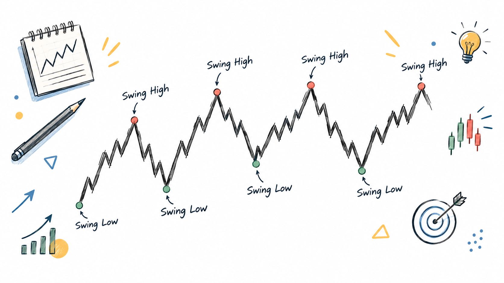
A swing high is the candle high that stands above the highs on both sides of it. A swing low is the mirror image, the candle low that sits below the lows on both sides. That's the whole foundation. If you can label those two points cleanly, the rest of the chart starts to make sense.
Confirm the swing, don't guess it
A swing isn't real just because a candle looks tall. It becomes useful only after the next candles confirm it by failing to push through the minor turn that followed. That's why traders wait. They're not being slow, they're avoiding false labels.
Start on the left side of a chart and move right. Mark the first clear high, then the next clear low, then the next high. If the new high breaks the prior high, you've got a higher high. If the pullback holds above the prior low, you've got a higher low. The same logic flips for lower highs and lower lows.
Clean read: one swing tells you where price turned. Two swings tell you whether control is shifting.
Don't confuse equal highs with a real break
Equal highs can look like a breakout, but they're often just repeated tests of the same area. Micro swings can also fool you on a noisy chart. If you keep labeling every tiny turn, the chart turns into static.
Use the dominant timeframe first. A small swing on a fast chart can matter for entry timing, but it shouldn't erase the larger structure unless the bigger sequence also changes. That's the part newer traders miss. They treat every wick like a regime shift.
A simple exercise helps. Open any chart and label only four points, the last swing high, the last swing low, the next higher high or lower low, and the current pullback. If your labels are consistent, the trade question gets simpler too. Is the prior swing in danger, or is price still inside the same structure?
For a related refresher on price patterns, see the chart examples in crypto chart patterns.
Reading Trends and Ranges from the Swing Sequence
An uptrend isn't just a line pointing up. It's a sequence of higher highs and higher lows. A downtrend is the opposite, lower highs and lower lows. A range sits in the middle, with price failing to expand cleanly in either direction and bouncing between a repeated ceiling and floor.
The sequence matters more than the label
A single break does not automatically flip a trend. One wick through a prior level can be a probe, not a change in control. Traders get burned when they treat the first breach as proof and jump too early.
The safer read is mechanical. Count the last four swing points. If they step up, the market is still behaving like an uptrend. If they step down, the downtrend is intact. If the points are trapped in a band and neither side follows through, you're likely looking at a range.
That's why transitions matter. The first lower low after a long run of higher lows is a warning. It says the swing sequence is no longer as clean as it was. You don't need to force a reversal label on the spot, but you do need to reduce trust in the prior trend.
Timeframe context changes the answer
A five-minute range can sit inside a four-hour uptrend. That isn't a contradiction. It's context.
If you trade the lower timeframe, the range may give you entries and stops. If you trade the higher timeframe, the same action may just be a pause inside a larger move. The mistake is reading one chart in isolation and acting as if it defines the whole market.
Trader's habit: if the last four swings don't let you name the regime in one sentence, the chart is either noisy or you're looking at the wrong timeframe.
Use the swing sequence to answer one question first, trend, range, or transition. Once that's clear, the rest of the plan gets cleaner.
Drawing Support and Resistance from the Same Points
Support and resistance are not separate ideas. They're the same swing points viewed from a horizontal angle. A prior swing low becomes a place where buyers previously stepped in. A prior swing high becomes a place where sellers previously showed up.
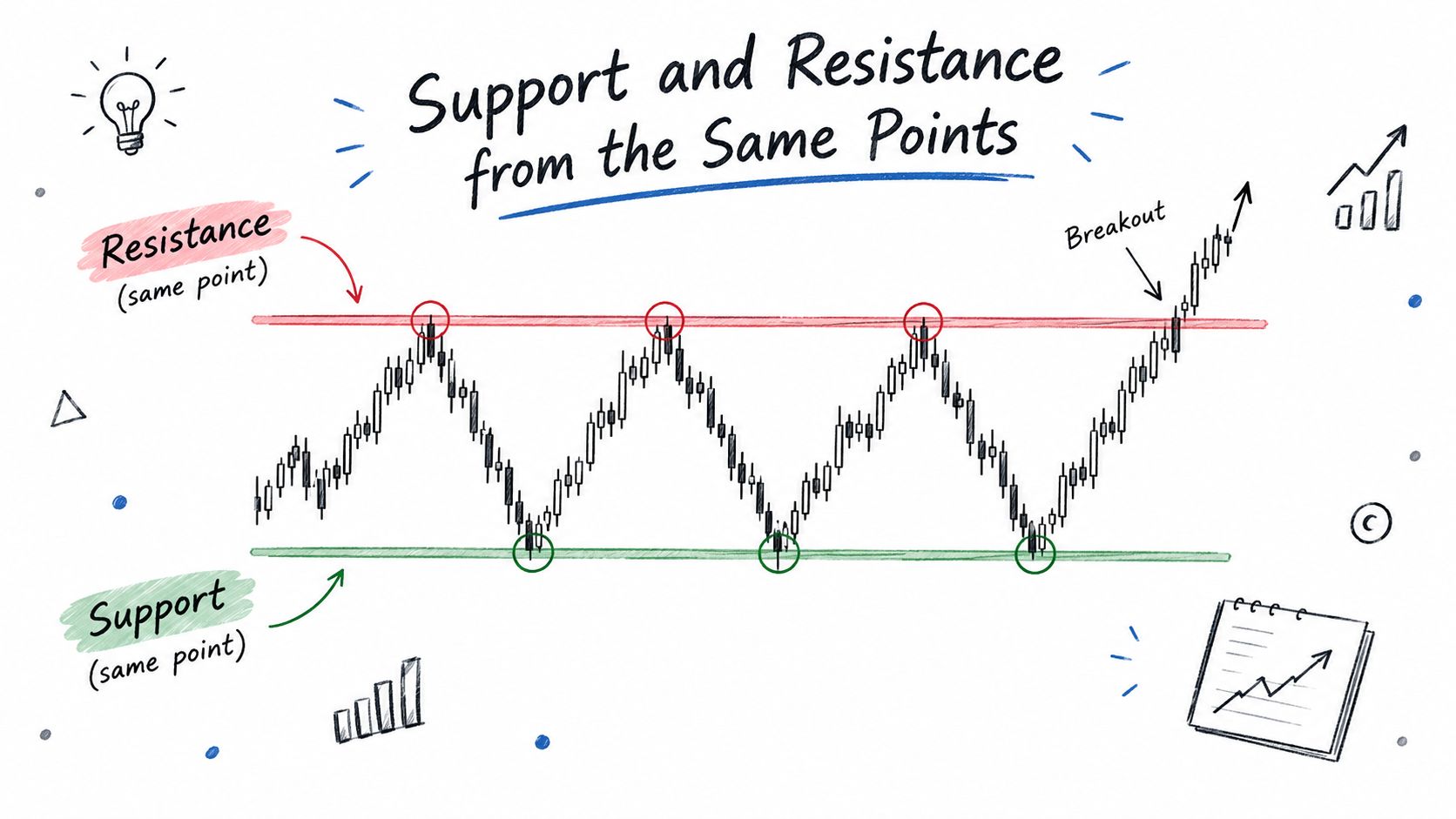
A zone works better than a hairline because the market rarely respects a single exact tick. Wicks, bodies, and failed attempts usually cluster in a band. Mark that band. Then stop pretending the market owes you precision it doesn't use.
Build the zone from the swing, not from your opinion
Start with the swing sequence you already mapped. Take the most obvious turning point and widen it just enough to include the nearby candles that mattered. That's your zone. If price returns there, you're not looking for a perfect touch, you're looking for a reaction.
A reaction candle matters more than a touch. If price pokes the zone and immediately rejects, that tells you more than a neat tap with no response. If price slices through and holds, the old zone is probably no longer doing the same job.
Keep the chart readable
A chart with too many lines becomes a chart with no decision quality. Traders start seeing levels everywhere and then talk themselves into trades they wouldn't take with a cleaner map. Mark only the zones that came from real swing turns.
After you mark one zone, test it against the next swing. Did price respect it, overshoot it, or ignore it completely? That answer tells you whether the zone deserves to stay on the chart.
If you want a practical companion to stop placement, the logic in this guide on stop loss placement lines up with the same structural thinking.
Liquidity Pools and Structure Breaks
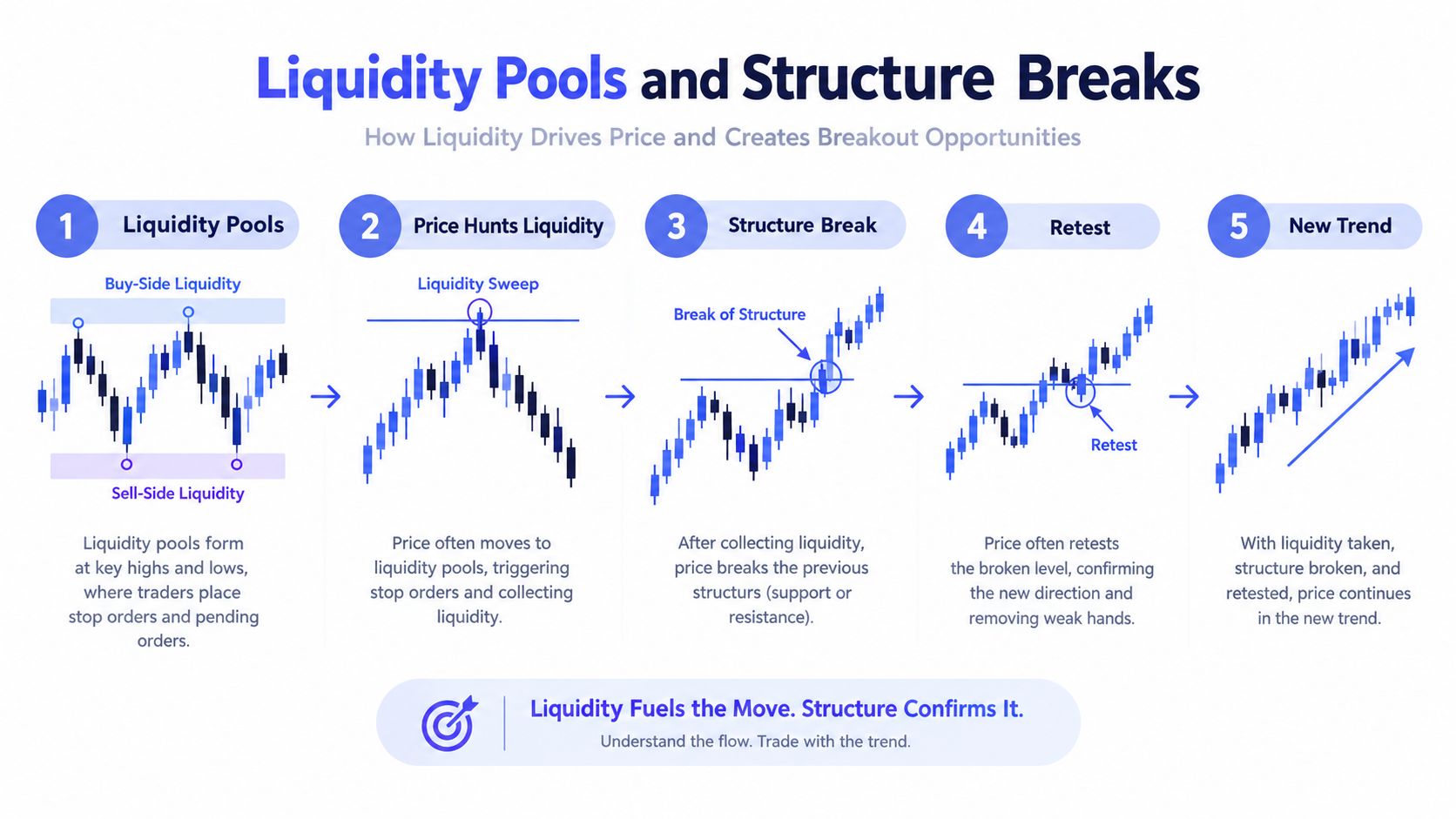
A visible swing high or swing low usually has stops sitting just beyond it. That's the liquidity pool. Everyone sees the same obvious level, so everyone tends to place risk around the same area. The market often moves there first for a reason.
Not every break is the same
A break through structure means more when it also sweeps obvious resting liquidity. If price runs a prior high, clears the stops above it, and then holds, that break has more weight than a random poke through the middle of a range. It has taken out real orders.
If the breach happens in the middle of nowhere, with no obvious pool around it, treat it with more caution. Those moves often fade back into the prior range. They look impressive for a moment, then they give the level back.
The useful question is simple. Did the break take liquidity, or just tag a level?
Practical rule: if the break didn't clear obvious stops or hold on the retest, it's not the same as a structural shift. It's just a breach until proven otherwise.
Combine the sweep and the hold
The best filter is two steps. First, mark the swing and the liquidity resting beyond it. Second, grade the move by whether price held after the sweep. A sweep without hold is weak. A sweep with acceptance is stronger.
That filter keeps you from reacting to every breach. You only care about the ones that did real work, cleared meaningful orders, then respected the new area. That's where structure starts to matter for trade decisions, not just chart reading.
Planning Entries Stops and Exits Around Structure
Entries are cleaner on retests than on breakout candles. If price takes a swing high and then comes back to it from above, that old resistance can act like support. That gives you a tighter entry than chasing the move after it already stretched.
Put invalidation where the chart proves you wrong
A stop belongs beyond the next swing low, not at a random round number. That way, your invalidation matches the chart's own logic. If price breaks the swing that should have held, the thesis is broken.
Targets should also come from structure. You can project toward the next visible swing, or use the distance between prior swings as a rough frame for the move. The point is not to invent a target out of thin air. It's to anchor the exit to a level the market has already respected.
Keep the trade honest after entry
Partial exits at the first opposing swing can reduce pressure. A runner toward the next structure level keeps the trade from ending too early. Both choices are tied to what price is doing, not to a hope that the move keeps going forever.
Use the same logic every time:
- Entry: on the retest of broken structure, not the first spike.
- Stop: beyond the swing that would prove you wrong.
- Target: at the next visible swing or prior reaction zone.
That makes the plan reviewable later. You can see exactly why you entered, where you were wrong, and whether the exit respected the chart or just the mood of the moment.
Structure Meets Execution and Slippage
A clean chart doesn't guarantee a clean fill. The 15-minute structure can look perfect, then the order lands worse than expected because the market moved, widened, or got hit with fast flow. That gap is where traders lose track of reality.
The chart is not the fill
A market can trade through your price while you're still waiting for execution. Spread can widen. A stop can trigger into a thin pocket. The fill can land away from the exact level you expected. That's slippage, and it belongs in the plan before you press the button.
For a broader look at how execution drift shows up in crypto, the discussion in what slippage means in crypto fits here.
If your idea only works when the fill is perfect, the idea is fragile. Stress-test it. Ask what happens if the execution lands a little worse than intended. If that still keeps the trade inside your risk limit, the plan is solid. If it doesn't, the position is too tight for the market you're trading.
Compare the read with the outcome
| Scenario | Chart Read | Typical Execution Gap |
|---|---|---|
| Breakout retest | Broken resistance turns into support | Fill can arrive after the first bounce |
| Stop-run reversal | Liquidity sweep and rejection | Entry may miss the exact wick low |
| Range fade | Price stalls at the top of a band | Spread can widen near the turn |
That gap between the chart and the fill is not a side issue. It's part of the trade. Structure tells you where the thesis lives. Execution tells you whether the P&L can still survive the path there.
Putting the Read and Act Loop Together
A trader who reads structure well doesn't start with a prediction. They start with a sequence. The steps stay the same, even if the market changes.
- Scan the swing sequence. Mark the last clear highs and lows.
- Classify the regime. Trend, range, or transition.
- Mark zones. Turn the main swing points into support and resistance areas.
- Check liquidity. Look just beyond obvious highs and lows for pooled stops.
- Wait for the trigger. Break, retest, or sweep and hold.
- Place the trade. Entry, stop, and target all sit on visible structure.
- Account for execution. Slippage and fill quality still matter before size is final.
That loop takes seconds on a chart you know well. It takes longer on a fresh one, and that's fine. Slowing down is part of reading correctly.
A short checklist keeps the work honest:
- Can I name the last swing high and low without guessing?
- Is the market trending, ranging, or changing character?
- Did price take liquidity, or just clip a level?
- Does my stop sit where the chart proves me wrong?
- Would worse execution still leave the trade acceptable?
If the answers are unclear, the chart isn't ready. Wait for a cleaner structure. That discipline matters more than forcing a trade because a candle looks interesting.
If you want cleaner structure calls and trade examples in one place, start with copyfomo on Telegram. It's built for traders who want their entries and exits mirrored without losing sight of the chart. Use it as a way to study structure, execution, and timing with less manual drift.
stop reading. start copying.
pick a trader from the fomo leaderboard, set your size, and the entries and the exits land in your own wallet while you sleep.
open copyfomo on telegram →